Technical Analysis Guides – Part 9: How to Draw and Use Trendlines Effectively
Among all the tools available in technical analysis, the trendline is one of the most intuitive. With just a few points and a straight line, you can visualise whether a market has been climbing, falling or moving sideways, and how quickly that move has unfolded.
Trendlines do not predict the future on their own. Instead, they provide a framework for thinking about direction, momentum and potential areas of interest. When used together with other forms of analysis, they can help bring more structure and discipline to decision-making.
This article is for informational and educational purposes only. It does not constitute financial, investment, tax or legal advice.
1. What Is a Trendline?
A trendline is a straight line drawn on a price chart that connects a series of important highs or lows. It highlights the prevailing direction of the market and can act as a dynamic reference area similar to support or resistance.
Conceptually, you can think of trendlines as the diagonal cousins of horizontal support and resistance zones:
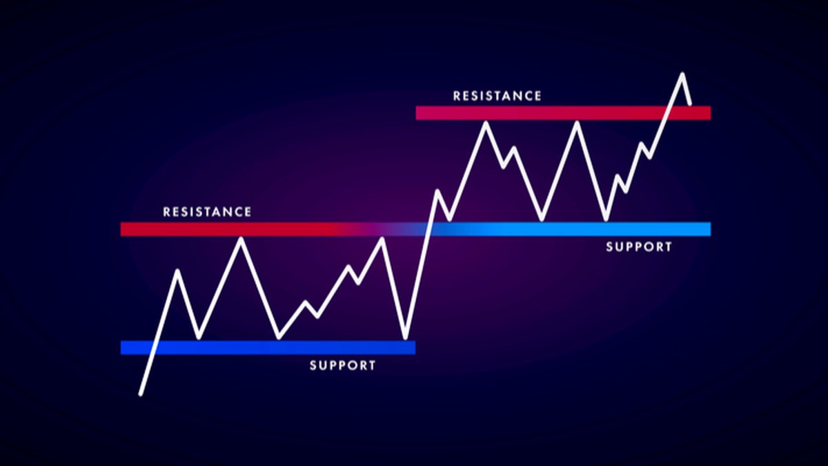
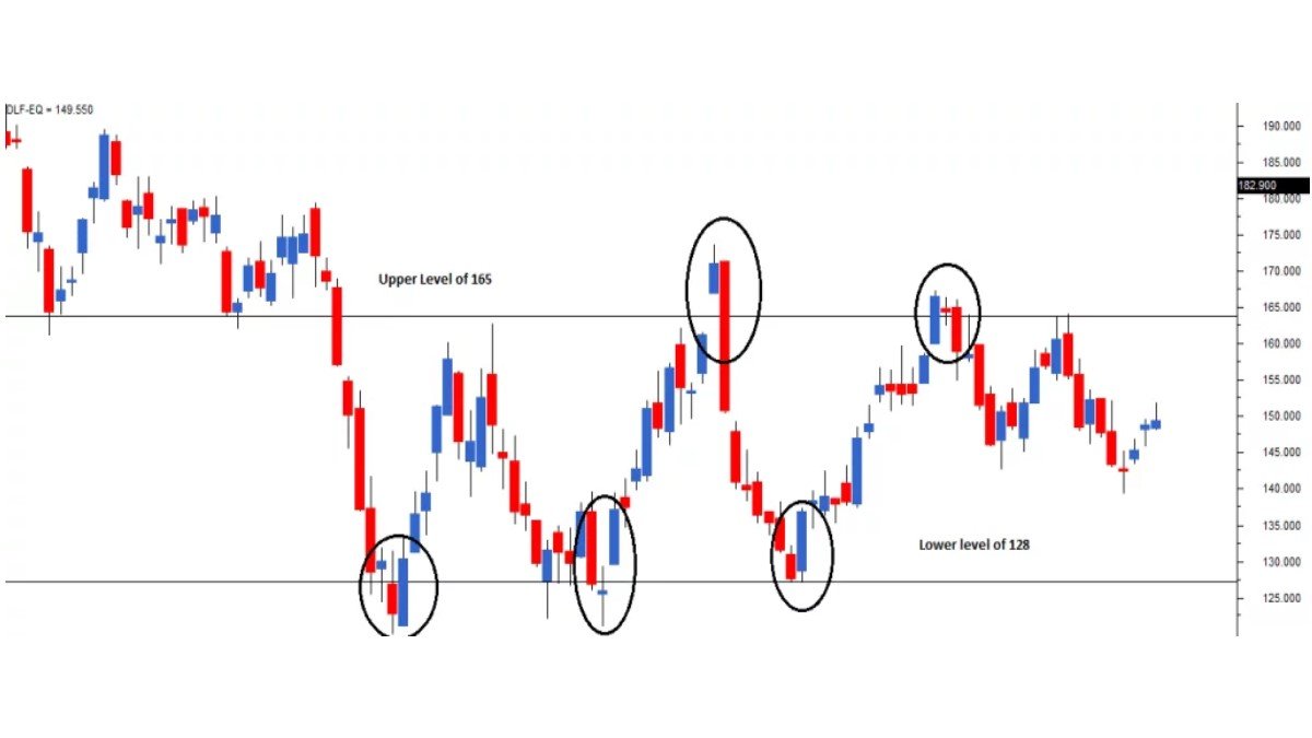
- Horizontal levels mark areas where price has repeatedly stalled at the same approximate value.
- Trendlines mark areas where price has respected a slope over time, such as consistently forming higher lows or lower highs.
The basic idea is simple but powerful: if price has respected a particular slope multiple times in the past, some market participants may continue to pay attention to that line in the future.
2. The Three Basic Types of Trend
Before drawing any lines, it helps to classify what kind of environment you are looking at. In most markets, price tends to alternate between three broad states:
- Uptrend: price forms higher highs and higher lows over time.
- Downtrend: price forms lower highs and lower lows.
- Sideways / range: price oscillates between horizontal boundaries without a clear slope.
Trendlines are most useful during clear uptrends and downtrends. In sideways phases, horizontal support and resistance levels often provide clearer context than diagonal lines.
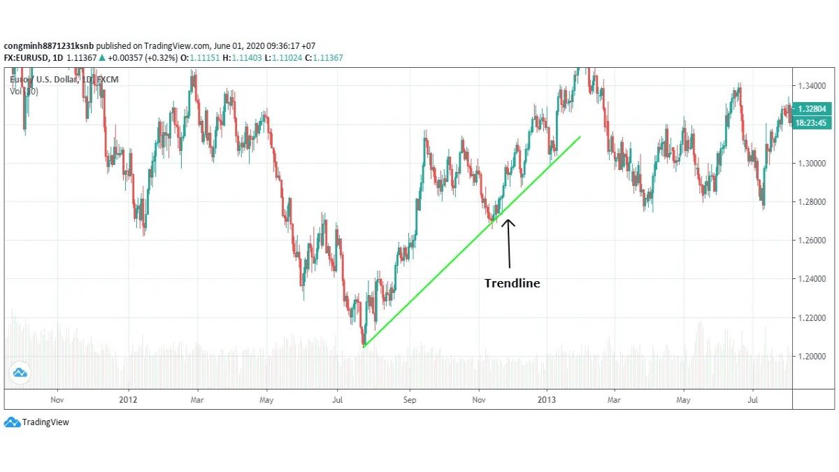
3. How to Draw an Uptrend Line
An uptrend line connects a series of higher lows and sits below price. It visualises the rising path that pullbacks have followed during an advance.
A step-by-step approach:
- Identify at least two significant swing lows.
These are points where price declined, found support and then moved upward again. The second low should be higher than the first. - Draw a line through the lows.
Connect the first low to the second low with a straight line that extends to the right. This is your preliminary trendline. - Watch for a third touch.
When price returns to this area later and respects the same slope, many analysts treat this third contact as confirmation that the line is meaningful.
In practice, the more times price 'leans' on an uptrend line without breaking it decisively, the more attention that line may attract. However, very steep uptrend lines—where price shoots upward almost vertically—are often less sustainable and may break more easily than gentler slopes.
4. How to Draw a Downtrend Line
A downtrend line connects a series of lower highs and sits above price. It shows the falling path that rallies have followed during a decline.
The process is similar, but mirrored:
- Identify at least two significant swing highs.
These are points where price rallied, encountered resistance and then turned lower. The second high should be lower than the first. - Draw a line through the highs.
Connect the first high and second high with a straight line and extend it to the right. - Look for additional touches.
If later rallies stall near this line again, the downtrend line is being respected and may serve as a reference area for the ongoing move.
As with uptrend lines, a downtrend line with multiple clean touches over time is often considered more notable than one based on just two points.
5. Timeframes and Reliability
Trendlines exist on every timeframe—from one-minute charts to monthly charts—but not all trendlines carry the same weight.
- Higher timeframes (daily, weekly, monthly) often show more durable trends. Lines drawn here tend to be watched more closely because they summarise longer periods of behaviour.
- Lower timeframes can reveal fine-grained detail and short-term patterns, but their trendlines may be more prone to temporary noise.
Many analysts start by marking key trendlines on higher timeframes, then zoom in to shorter horizons to refine entries, exits or risk parameters if they choose to act.
6. Imperfect Fits: Wicks, Closes and Zones
In textbooks, trendlines often touch every swing high or low perfectly. Real markets are messier. Candles have wicks, intraday volatility creates spikes and different exchanges may show slightly different prints.
Some practical guidelines:
- Think of a trendline as a zone rather than a single, perfect price.
- It is common for a valid trendline to cut through a few wicks while still capturing the overall slope of the move.
- Many chart users focus on whether closing prices respect the line rather than reacting to every intraperiod spike.
- If a proposed trendline has to be bent or placed in a way that slices through the middle of many candles just to “fit”, it may not be reliable.
The goal is not to force the market to respect a pre-drawn line, but to draw lines that honestly reflect what price has already done.
7. Trendlines as Dynamic Support and Resistance
Once a trendline has been established with several touches, some market participants treat it as a form of dynamic support or resistance:
- In an uptrend, the rising trendline beneath price is often viewed as a support zone where pullbacks have previously slowed.
- In a downtrend, the falling trendline above price is often viewed as a resistance zone where rallies have previously lost strength.
These reference areas can help structure thinking about scenarios. For example, if price is approaching an established uptrend line, an analyst may pay closer attention to how the market behaves there—whether it bounces, consolidates or begins to break through.
On their own, however, trendlines do not provide definitive instructions. Many practitioners look for additional evidence such as candlestick formations, volume behaviour or other indicators before making decisions.
8. Trendline Breaks and Retests
Eventually, most trendlines stop working. When price moves decisively through a well-respected line, some analysts talk about a trendline break. This can indicate that the prior pace or direction of the trend is changing.
Two common concepts appear in educational material:
- Initial break: price moves through the trendline and closes on the other side, suggesting that the previous pattern has been interrupted.
- Retest: after the break, price sometimes returns to the area of the old trendline from the other side. If it reacts there, the former support may act as new resistance, or vice versa.
It is important to treat these events as signals to reassess, not as guarantees of a large move. Breaks can occasionally reverse quickly. Some practitioners therefore wait for confirmation—such as multiple closes beyond the line, or alignment with other factors—before drawing strong conclusions.
9. Combining Trendlines With Other Tools
Trendlines are most powerful when used alongside other elements of technical analysis. Examples of complementary tools include:
• Horizontal support and resistance: When a trendline intersects with a well-established horizontal level, the area of confluence may be especially noteworthy.
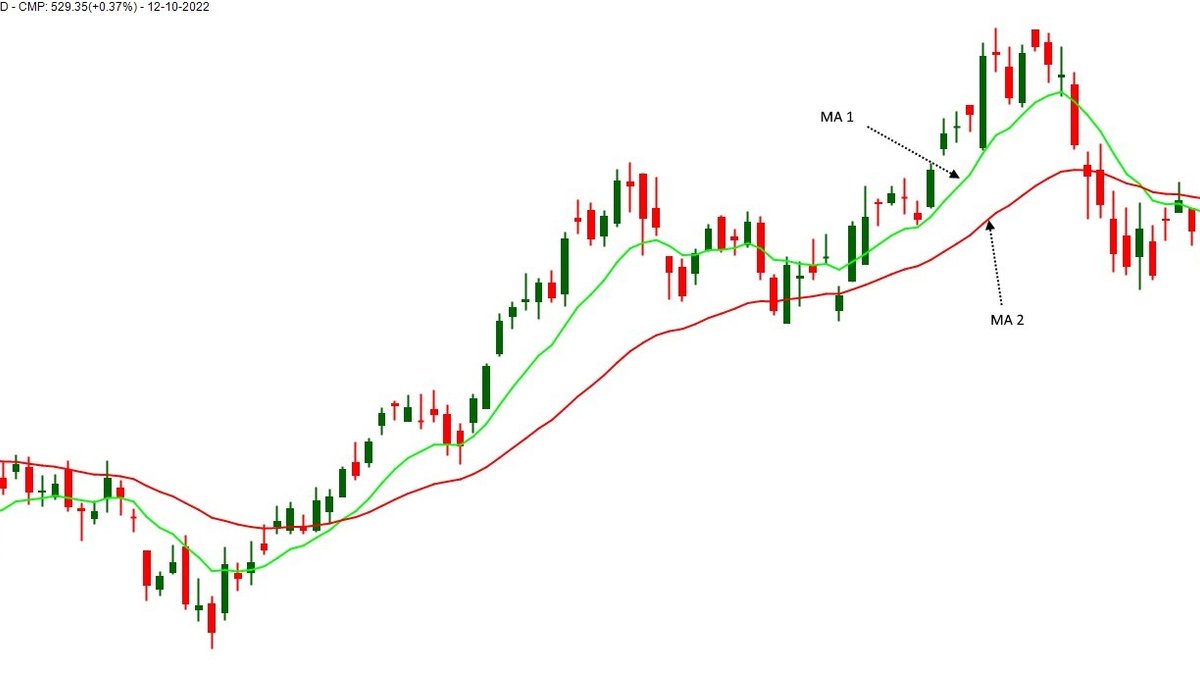
• Moving averages: A rising trendline that aligns with a long-term moving average can create a layered support region rather than a single line.
• Momentum indicators: Tools such as RSI, Stochastic or MACD can offer additional context about whether a trendline touch occurs during strong or weakening momentum.
• Volatility tools: Envelopes such as Bollinger Bands or Keltner Channels can show whether price is stretched while interacting with a trendline.
Regardless of the combination, risk management remains central. No trendline, pattern or indicator removes the need to consider position size, diversification and personal financial circumstances.
10. A Simple Practice Routine for Trendlines
To build confidence with trendlines, it can be useful to follow a structured practice routine:
- Choose one asset and one timeframe (for example, a daily chart of a major cryptocurrency or index).
- Scroll back in time and mark historical swings, drawing uptrend and downtrend lines wherever they seem appropriate.
- Move forward bar by bar to see how price reacted around those lines. Did they hold? When did they break? Was there a retest?
- Repeat on a different timeframe and note how higher-timeframe lines interact with shorter-term moves.
- Record observations in a simple journal, focusing on what made lines useful or unreliable in hindsight.
Over time, this exercise can sharpen your ability to see structure quickly and to distinguish between meaningful trendlines and lines that are more cosmetic.
11. Key Takeaways
• A trendline is a diagonal line connecting a series of highs or lows, used to visualise the direction and speed of price movement.
• Uptrend lines connect higher lows and sit below price; downtrend lines connect lower highs and sit above price.
• At least three touches generally make a trendline more credible than a line drawn from only two points.
• Trendlines are approximations, not perfect fits. It is normal for them to function as zones rather than exact prices.
• Breaks of well-established trendlines signal that market behaviour may be changing, but they should be evaluated in context alongside other tools and sound risk management.
This guide is provided solely for informational and educational purposes. It does not constitute financial, investment, tax or legal advice and should not be treated as a recommendation to buy, sell or hold any asset or to follow any specific approach. Markets can be volatile and involve risk, including the possibility of loss. Always consider your own circumstances and, where appropriate, consult qualified professionals before making financial decisions.