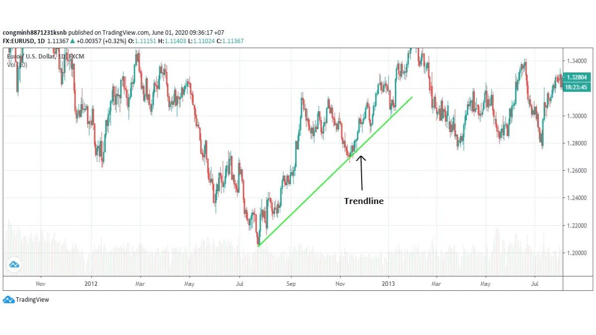
Technical Analysis Guides – Part 10: Understanding and Using the MACD Indicator
In many charting platforms, the MACD indicator sits just beneath price, pulsing up and down as trends strengthen, weaken or reverse. MACD, short for Moving Average Convergence Divergence, is one of the most widely used momentum tools in technical analysis for stocks, forex and digital assets.
At its core, MACD compares two exponential moving averages (EMAs) of price to reveal whether buyers or sellers have recently been more active and how quickly that balance is changing. It can help answer practical questions such as: Is this trend still gaining strength? Is momentum fading? Has the short-term tone just shifted?
This guide is purely educational. It does not provide financial, investment, tax or legal advice, and it does not recommend any specific asset or strategy.
1. What Exactly Is MACD?
MACD is a trend-following momentum indicator. Instead of looking at price alone, it measures the distance between two moving averages and then smooths that distance to highlight shifts in momentum.
The name describes its behaviour:
- Moving Average: it is built from exponential moving averages of price.
- Convergence: when the two EMAs move closer together, momentum is cooling.
- Divergence: when the EMAs move further apart, momentum is strengthening.
Because MACD focuses on the relationship between averages rather than single candles, it can filter out some noise while still reacting reasonably quickly to changes.
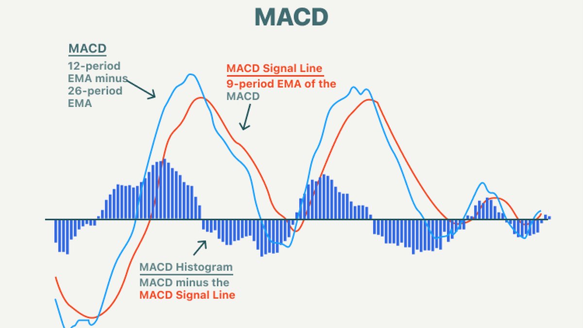
2. The Three Components of MACD
On most platforms, MACD is displayed with three elements:
- MACD line: the difference between a short-term EMA and a longer-term EMA.
- Signal line: a smoothed version of the MACD line, typically a 9-period EMA of MACD itself.
- Histogram: a bar chart showing the distance between the MACD line and the signal line.
Visually:
- When the MACD line is above the signal line, the histogram bars are usually above zero.
- When the MACD line is below the signal line, the histogram bars are usually below zero.
- The taller the bars, the greater the difference in momentum between the two lines.
3. How MACD Is Calculated
While most charting tools calculate MACD automatically, understanding the formula helps you interpret it more confidently.
With standard settings, the calculations are:
- MACD line = 12-period EMA − 26-period EMA
- Signal line = 9-period EMA of the MACD line
- Histogram = MACD line − signal line
The shorter EMA (12 periods) reacts faster to recent price changes, while the longer EMA (26 periods) reacts more slowly. When recent prices accelerate in one direction, the fast EMA pulls away from the slow EMA, and the MACD line moves further from zero. When price action calms down, the EMAs move closer together, and MACD drifts back toward the centre.
4. The Zero Line: Where Trend and Momentum Meet
MACD oscillates around a horizontal zero line, also called the centre line.
- When the MACD line is above zero, the short-term EMA is above the long-term EMA, which usually corresponds to an upward bias.
- When the MACD line is below zero, the short-term EMA is below the long-term EMA, often reflecting a downward bias.
Moves through the zero line can signal a change in the underlying trend tone. For example, a shift from negative to positive MACD may indicate that average prices over the shorter period have started to outpace the longer period.
5. Default Settings and Possible Adjustments
The classic MACD configuration is written as MACD(12, 26, 9), where:
- 12 = number of periods in the fast EMA
- 26 = number of periods in the slow EMA
- 9 = number of periods used for the signal line EMA
These values became standard partly due to their widespread use on daily charts. Many analysts keep them unchanged for consistency and to align with how others view the same market.
That said, some market participants experiment with alternative settings to better match their timeframe or style:
- Shorter EMAs (for example, 8 and 17) make MACD more sensitive to quick moves but can increase noise.
- Longer EMAs (for example, 19 and 39) smooth the indicator and may better suit those who focus on broader swings.
Any adjustment involves trade-offs between responsiveness and stability. It is usually best to test new settings on historical charts before using them in live decisions.
6. Key MACD Signals and How They Are Interpreted
MACD can generate several types of information. Below are the most common ways analysts interpret it, always remembering that no single signal is definitive on its own.
6.1 Signal-Line Crossovers
The most widely watched event is a crossover between the MACD line and the signal line:
- A bullish crossover occurs when the MACD line moves from below to above the signal line. This indicates that short-term momentum has turned upward relative to recent history.
- A bearish crossover occurs when the MACD line moves from above to below the signal line, suggesting a shift toward downward momentum.
Some traders pay special attention when these crossovers happen far from the zero line, as they may highlight strong changes in momentum after an extended move.
6.2 Zero-Line Crossovers
Zero-line, or centre-line, crossovers focus on the trend backdrop:
- A move from negative to positive MACD is often viewed as a sign that an upward phase could be developing.
- A move from positive to negative MACD may indicate that a downward phase is gaining traction.
These shifts tend to occur later than some other signals but can help confirm that a broader trend change has taken place.
6.3 The MACD Histogram
The histogram visually represents the distance between the MACD and signal lines:
- Expanding bars show that the gap between the two lines is widening, which often corresponds to strengthening momentum.
- Contracting bars show that the lines are converging, suggesting that momentum is fading even if price is still moving in the same direction.
Some analysts use histogram peaks and troughs to anticipate potential crossovers, as the histogram returns toward zero when the MACD and signal lines approach each other.
6.4 Divergence Between Price and MACD
Divergence occurs when price makes a new high or low but the MACD indicator does not confirm that move.
- Bullish divergence: price makes a lower low, but MACD forms a higher low. This can suggest that downward momentum is weakening.
- Bearish divergence: price makes a higher high, but MACD forms a lower high, hinting that upward momentum is losing strength.
Divergences are often treated as early warning signs rather than immediate signals. They highlight that the current trend may be stretching, but they do not specify exactly when or how strongly price might respond.
7. A Practical Workflow for Using MACD
To use MACD in a structured way, many analysts follow a simple checklist-style workflow instead of acting on isolated signals.
1. Assess the larger trend.
Start with price structure: are highs and lows generally rising, falling or ranging? MACD should support, not replace, this initial assessment.
2. Observe the MACD position.
Is the MACD line mainly above or below zero? This helps frame whether the market has recently been biased upward or downward.
3. Look at the histogram.
Are bars expanding or contracting? This hints at whether current momentum is accelerating or cooling.
4. Watch for crossovers in context.
MACD–signal crossovers near strong support or resistance zones, or following extended moves, may carry more informational weight than those in the middle of a noisy range.
5. Check for divergence.
If price makes a new extreme while MACD does not, treat it as a prompt to review risk, not as proof that a reversal must happen.
6. Combine with other tools and risk rules.
Support/resistance analysis, volume, volatility measures and personal risk limits should all factor into any decision.
8. Strengths and Limitations of MACD
Like any indicator, MACD has clear advantages and clear boundaries.
8.1 Strengths
- Combines trend and momentum: MACD shows both the direction of the prevailing move and the pace at which it is changing.
- Relatively simple to read: once you understand crossovers and the zero line, the visual signals are straightforward.
- Widely used: its popularity means many market participants watch similar features, which can sometimes reinforce its relevance.
8.2 Limitations
- Lagging nature: MACD is built from moving averages, which means it will always reflect price movements with some delay.
- Short- to medium-term focus: with default 12- and 26-period EMAs, MACD is not designed to capture very long-term cycles on its own.
- Choppy in sideways markets: when price ranges without a clear trend, MACD can produce frequent crossovers that do not lead to meaningful continuation.
Because of these limitations, many practitioners treat MACD as one piece of a larger puzzle rather than as a stand-alone decision engine.
9. Example: Analysing a Hypothetical Uptrend With MACD
Imagine a liquid digital asset that has been trending upward on the daily chart. Price has made a series of higher lows for several weeks.
1. MACD has been above zero for most of the rally, confirming an overall upward bias.
2. During pullbacks, the histogram contracts and sometimes dips slightly below zero, showing temporary cooling of momentum while the broader structure remains intact.
3. After one such pullback, a bullish MACD–signal crossover appears near a previously identified support zone. Volume picks up slightly and price forms a constructive candle pattern.
4. Later in the trend, price pushes to a new high but MACD forms a lower high, creating mild bearish divergence. This does not guarantee a reversal, but it may prompt some participants to tighten risk or reduce exposure.
This type of scenario illustrates how MACD can frame stages within a trend: expansion, consolidation, renewed strength and potential fatigue.
10. Key Takeaways
• MACD is a trend-following momentum indicator based on the difference between two EMAs and a smoothed signal line.
• The standard settings, MACD(12, 26, 9), remain widely used, but variations exist for different time horizons.
• Analysts focus on signal-line crossovers, zero-line crossovers, histogram expansion or contraction and divergence between MACD and price.
• MACD works best in markets that show clear, sustained trends and can be less helpful in very choppy ranges.
• As with any indicator, MACD is most effective when combined with sound risk management and other technical or fundamental perspectives.
This article is intended solely for informational and educational purposes. It does not constitute financial, investment, tax or legal advice, and it should not be treated as a recommendation to buy, sell or hold any asset or to follow any specific approach. Digital assets and other financial instruments involve risk, including the possibility of loss. Always consider your own circumstances and, where appropriate, consult qualified professionals before making financial decisions.