Technical Analysis Guides – Part 5: Understanding the Relative Strength Index (RSI)
The Relative Strength Index (RSI) is one of the best-known momentum oscillators in technical analysis. Whether you are looking at equities, foreign exchange or digital assets, RSI is almost always available as a built-in tool on modern charting platforms.
RSI was introduced by J. Welles Wilder in 1978. His goal was to create an indicator that shows, in a single number between 0 and 100, how strong recent price moves have been on average: are gains dominating, are losses dominating, or is the market roughly in balance?
This guide is for informational and educational purposes only. It does not provide financial, investment, tax or legal advice.
1. What Is the RSI Indicator?
At its core, RSI is a way to measure relative momentum over a chosen lookback period (commonly 14 candles by default). Instead of focusing on where price is in absolute terms, RSI asks a different question:
- Over the last N periods, how large have the average upward moves been?
- How large have the average downward moves been?
RSI then compares those two averages and expresses the result as a value between 0 and 100:
- Values closer to 100 indicate that gains have dominated over the lookback window.
- Values closer to 0 indicate that losses have dominated.
- Values near 50 suggest a more balanced environment.
This simple structure makes RSI a convenient way to discuss the strength of a move without getting lost in raw price changes.
2. How RSI Is Calculated (Conceptual Overview)
Most charting platforms compute RSI automatically, but understanding the logic behind the formula makes the indicator much easier to interpret.
The standard 14-period RSI uses the following steps:
- For each period, compute the change in closing price compared with the previous close.
- Separate those changes into up moves (gains) and down moves (losses).
- Compute smoothed averages of gains and losses over the lookback window.
- Form the ratio of average gain to average loss, often written as RS (Relative Strength).
Once RS is known, RSI is derived via Wilder's formula:
RS = Average Gain / Average Loss
RSI = 100 − [100 / (1 + RS)]
The result is a single number between 0 and 100 that summarises the balance between upward and downward pressure over the chosen horizon. If average loss is very small compared with average gain, RS is large and RSI moves toward 100; if average gain is small relative to average loss, RSI moves toward 0.
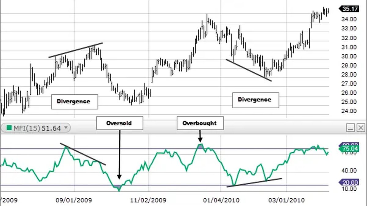
3. Reading the RSI Scale: 0–100, 30/70 and the Midline
By design, RSI cannot go below 0 or above 100. Within that band, a few reference levels are commonly used to describe conditions:
- 70 and above – often described as a potentially overbought or stretched upward condition.
- 30 and below – often described as a potentially oversold or stretched downward condition.
- 50 – a midline that marks the boundary between gain-dominated and loss-dominated momentum.
Textbook descriptions sometimes summarise RSI as follows:
- If RSI climbs above 70, it may indicate that recent gains have been unusually strong.
- If RSI falls below 30, it may indicate that recent losses have been unusually strong.
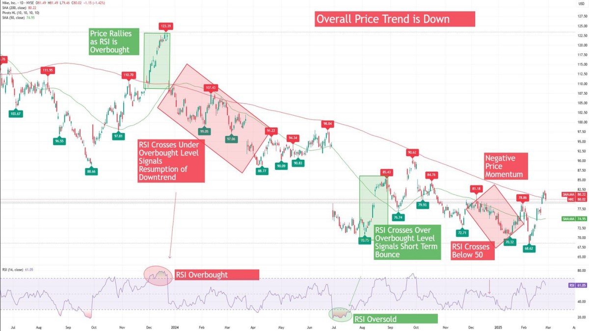
However, this simple picture comes with important caveats. In strong trends, RSI can remain above 70 or below 30 for extended periods. Treating these zones as automatic turning points can be misleading. Many practitioners talk instead about stretched momentum rather than making assumptions about immediate reversals.
4. RSI Ranges in Uptrends and Downtrends
Beyond the standard 30/70 thresholds, some analysts pay close attention to how RSI behaves across different environments. Over time, certain patterns have been observed:
- In many uptrends, RSI tends to oscillate roughly between 40 and 80, with the 40–50 zone acting as a kind of support in momentum terms.
- In many downtrends, RSI tends to oscillate between roughly 20 and 60, with the 50–60 zone acting as a kind of resistance in momentum terms.
These ranges are not strict rules, but they illustrate an important idea: instead of viewing RSI only as 'overbought vs. oversold', it can also be used to describe where the balance of power tends to sit during different phases of the market.
5. Regular Divergences Between RSI and Price
One of the most discussed aspects of RSI is the concept of divergence: situations where price and the indicator move in different directions.
5.1 Bullish-style divergences
A commonly cited bullish-style divergence occurs when:
- Price forms a lower low relative to a previous swing, while
- RSI forms a higher low in the same general area.
This pattern suggests that, even though price has pushed to a new low, the intensity of downward momentum has weakened compared with the earlier move. Some analysts treat this as an early indication that the selling phase could be losing strength.
5.2 Bearish-style divergences
A bearish-style divergence is the mirror image:
- Price prints a higher high than before, but
- RSI makes a lower high.
In this case, price has reached a new high, but the underlying momentum reflected by RSI has not kept up. This is often interpreted as a sign that the upward phase may be maturing.
5.3 Divergences as context, not certainty
It is crucial to remember that divergences are not guarantees. Markets can continue trending despite repeated divergences, and many reversals occur without clean divergence patterns. In practice, divergences are best treated as contextual clues that may merit extra attention, especially when they align with other factors such as support, resistance or changes in volume.
6. Hidden Divergences: Continuation Patterns in RSI
In addition to 'regular' divergences, many technicians discuss hidden divergences. Instead of hinting at potential reversals, these patterns are often viewed as potential continuation clues within an existing trend.
6.1 Hidden bullish-style divergences
A hidden bullish-style divergence typically appears in an uptrend when:
- Price forms a higher low (the trend structure remains upward), while
- RSI forms a lower low.
Here, price has respected its pattern of rising lows, but RSI has dipped more deeply before recovering. Some analysts interpret this as a sign that the pullback in momentum has reset conditions, potentially allowing the upward structure to continue.
6.2 Hidden bearish-style divergences
A hidden bearish-style divergence appears in a downtrend when:
- Price forms a lower high (the downward structure remains intact), while
- RSI forms a higher high.
In this case, price has respected its pattern of falling highs, but RSI has bounced more strongly before turning down again. This is sometimes interpreted as a sign that the downward structure may still be dominant despite a temporary strengthening in momentum.
7. Drawing Trend Lines and Patterns on RSI
Most people are familiar with drawing trend lines and patterns on price charts, but similar ideas can be applied to the RSI line itself.
Some chart users:
- Draw trend lines on RSI highs and lows to see whether momentum is forming its own uptrend or downtrend.
- Mark support and resistance bands on the RSI panel where the indicator has repeatedly reversed in the past.
- Look for simplified pattern structures—such as ranges or compressions—that show whether momentum is expanding or contracting.
While these techniques are more advanced and somewhat subjective, they illustrate that RSI is not just a number; it is a time series that can be analysed in its own right.
8. Using RSI on Modern Charting Platforms
Most mainstream charting platforms make it straightforward to add RSI to a chart. The general steps look something like this:
- Open the asset you want to study on your chosen platform (for example, a daily chart of a major cryptocurrency or stock index).
- Locate the indicators menu, and search for “Relative Strength Index” or “RSI”.
- Add the indicator to your chart. The default setting is often a 14-period RSI with horizontal lines near 30 and 70.
- Optionally adjust the lookback period or visual style if you have a specific framework in mind, and experiment with different timeframes (such as 4-hour, daily, weekly) to see how RSI behaves over different horizons.
A helpful habit is to keep the chart clean—RSI plus a small number of other tools—so that each indicator can be read clearly.
9. Common Pitfalls and Good Practices
RSI is powerful, but like any indicator, it can be misused. A few recurring themes are worth mentioning:
• Assuming extremes always reverse quickly: Strong trends can keep RSI above 70 or below 30 for long stretches. Treat these zones as descriptions of strong momentum, not as automatic reversal points.
• Ignoring the broader structure: An RSI reading can mean very different things in a multi-month range versus a clear, directional trend. Always consider where the asset is in its broader context.
• Relying on one indicator alone: No single tool captures all aspects of market behaviour. Combining RSI with price structure, volume, time horizon and risk management considerations tends to produce more robust frameworks.
• Chasing every small movement: Constantly reacting to minor RSI fluctuations on very low timeframes can be exhausting and unproductive. Many learners benefit from starting with higher timeframes and only later exploring shorter horizons.
10. A Practical, Educational Way to Study RSI
For readers who want to build intuition around RSI, a simple historical exercise can be very effective:
1. Choose a liquid market and apply a 14-period RSI on the daily chart.
2. Scroll back through history and mark periods when RSI moved above 70 or below 30. Observe what happened over the subsequent weeks, not just the next candle.
3. Identify examples of regular and hidden divergences and see which ones aligned with meaningful shifts in behaviour and which did not.
4. Note the typical RSI ranges during strong uptrends and strong downtrends, paying attention to where the indicator tended to find support or resistance.
5. Record your observations in a simple journal. Over time, this provides a personalised reference for how RSI tends to behave in the markets you follow.
This kind of review turns RSI from a mysterious curve into a familiar and well-understood part of your overall toolkit.
11. Key Takeaways
• The Relative Strength Index (RSI) is a momentum oscillator that compares average gains and average losses over a lookback period and expresses the result as a value between 0 and 100.
• Levels near 70 and 30 are often used to describe stretched conditions, while the 50 line highlights whether gains or losses have dominated recently.
• RSI can help frame discussions about momentum ranges in uptrends and downtrends, not just short-term extremes.
• Regular divergences between RSI and price can hint at waning momentum, while hidden divergences are often discussed in the context of trend continuation.
• Like any technical tool, RSI has limitations and works best as part of a broader, risk-aware framework that includes market structure, time horizon and personal objectives.
This article is provided for informational and educational purposes only. It does not constitute financial, investment, tax or legal advice and should not be treated as a recommendation to buy, sell or hold any asset or to use any specific approach. Markets involve risk, including the possibility of loss. Always consider your own circumstances and, where appropriate, consult qualified professionals before making financial decisions.