Technical Analysis Guides – Part 3: Understanding the Money Flow Index (MFI)
The Money Flow Index (MFI), sometimes called the money flow oscillator, is a popular technical indicator that combines both price and volume to describe buying and selling pressure. While many indicators look only at price, MFI asks a slightly different question: how much capital is actually flowing through this asset during each period, and is that flow dominated by upward or downward moves?
In this guide, we will explore how the MFI is built, what its 0–100 scale represents, how analysts interpret extreme readings and divergences, and where the indicator can be helpful or misleading. The focus is on clear, brand-safe education—not on shortcuts or promises.
Nothing in this article is financial, investment, tax or legal advice. It is for informational and educational purposes only.
1. What Is the Money Flow Index (MFI)?
The Money Flow Index is a bounded oscillator that moves between 0 and 100. It is often described as a volume-weighted version of the Relative Strength Index (RSI):
- RSI focuses on price changes over a lookback period.
- MFI incorporates both price and volume, giving heavier weight to periods where more units traded.
Because it accounts for trading activity, MFI is frequently used to evaluate whether an asset’s moves are supported by meaningful participation or whether price is drifting on relatively light volume.
In everyday language, you can think of MFI as a way to ask: “Is money flowing in or out of this asset with conviction?”
2. How the MFI Is Constructed
Although charting platforms calculate MFI automatically, understanding the steps behind the indicator helps you interpret what you see on the screen.
2.1 Step 1: Typical Price
For each period (for example, each day on a daily chart), we first compute a Typical Price (TP):
Typical Price = (High + Low + Close) / 3This single value summarises where the period traded overall.
2.2 Step 2: Raw Money Flow
Next, we estimate how much capital moved through the asset during that period by multiplying the Typical Price by volume:
Raw Money Flow = Typical Price × VolumeThis gives more weight to periods with higher trading activity.
2.3 Step 3: Positive and Negative Money Flow
Now we classify each period’s raw money flow as either positive or negative:
- If today’s Typical Price is higher than yesterday’s, today’s raw money flow is considered positive.
- If today’s Typical Price is lower than yesterday’s, today’s raw money flow is considered negative.
- If the Typical Price is unchanged, some implementations treat that period as neutral.
Over a chosen lookback window (often 14 periods by default), we then sum up:
- The total Positive Money Flow (all positive periods), and
- The total Negative Money Flow (all negative periods).
2.4 Step 4: Money Flow Ratio
With those sums in hand, we compute the Money Flow Ratio:
Money Flow Ratio = Positive Money Flow / Negative Money FlowIntuitively:
- A high ratio means positive flow has dominated over the lookback window.
- A low ratio means negative flow has dominated.
2.5 Step 5: Turning the Ratio into MFI
The final step is to transform the Money Flow Ratio into a bounded oscillator between 0 and 100 using an RSI-style formula:
MFI = 100 − (100 / (1 + Money Flow Ratio))The result is the familiar MFI line that platforms plot in a separate panel below price.
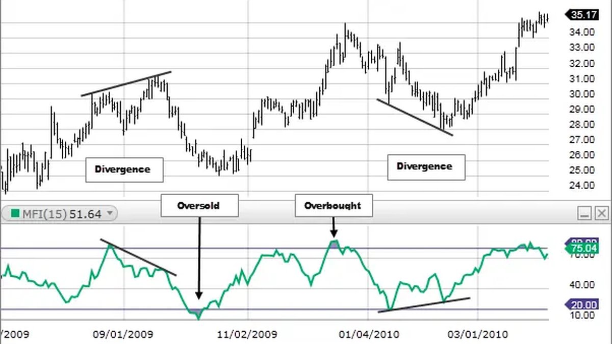
3. Reading the MFI Scale: Extremes and Market Context
Once calculated, MFI is displayed as a line between 0 and 100.
- Values closer to 100 indicate that, over the chosen lookback period, positive money flow has strongly outweighed negative flow.
- Values closer to 0 indicate the opposite: negative money flow has dominated.
Many practitioners use two key reference zones:
- Above 80: often described as a potentially overbought or stretched condition.
- Below 20: often described as a potentially oversold or depressed condition.
However, these thresholds are not rigid rules. Market regime matters:
- In strong uptrends, MFI can stay above 80—or oscillate between mid-range and high levels—for a long time without an immediate reversal.
- In strong downtrends, MFI can remain below 20 or return to that region multiple times as selling pressure persists.
For this reason, many analysts treat extreme MFI readings as warning flags that conditions are stretched, not as automatic instructions about what must happen next.
4. MFI vs. RSI: Similar Structures, Different Inputs
MFI and RSI share a similar mathematical backbone but differ in what they measure.
- RSI looks only at price changes, comparing the magnitude of recent gains and losses over a lookback period.
- MFI incorporates both price and volume by using raw money flow (price × volume) to separate positive and negative pressure.
Supporters of volume-based analysis often view MFI as a more 'complete' oscillator because it rewards periods where price moves are backed by active trading. In their view, a move accompanied by strong volume carries more informational weight than a similar move on thin volume.
In practice, MFI and RSI can diverge:
- There are moments when RSI shows a strong upward move, but MFI is more muted because volume has been light.
- Conversely, a modest price change with unusually high volume can make MFI more reactive than RSI.
This difference is neither inherently better nor worse; it simply reflects that each indicator emphasises different aspects of the same market behaviour.
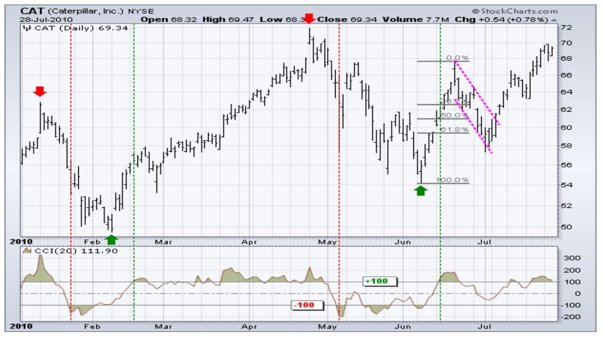
5. Divergences Between MFI and Price
One of the most discussed aspects of MFI is how it can diverge from price. A divergence occurs when price and the indicator move in different directions.
5.1 Bullish-style divergences
A commonly cited bullish-style divergence occurs when:
- Price prints a lower low compared with a previous swing, but
- MFI forms a higher low over the same general region.
This pattern suggests that while price has pushed to a new low, the downward move is attracting less negative money flow than before. Some observers interpret this as a sign that selling pressure may be weakening.
5.2 Bearish-style divergences
A bearish-style divergence occurs when:
- Price records a higher high, but
- MFI forms a lower high.
In this case, price is reaching new highs, but the underlying positive money flow is not keeping pace. This can be read as a hint that upward momentum is losing strength.
5.3 Divergences are not guarantees
It is important to stress that divergences are not guarantees of immediate reversals. In strong trends, several divergences can appear before a meaningful change occurs. There are also many reversals that happen without any clear divergence in the first place.
Because of this, divergences are best treated as contextual clues that may warrant closer monitoring, especially when they appear near significant support or resistance zones or alongside other forms of analysis.
6. Strengths and Limitations of the MFI
Like any indicator, the MFI has both strengths and weaknesses. Understanding both sides helps avoid overconfidence.
6.1 Where MFI can be helpful
- Volume awareness: By incorporating volume, MFI can highlight situations where price moves have unusually strong or weak participation.
- Clear structure: The 0–100 scale and the 20/80 reference zones give a straightforward visual framework for discussing stretched conditions.
- Divergence analysis: Differences between price and MFI can sometimes highlight shifts in underlying pressure before they are obvious on the chart.
6.2 Where MFI can be misleading
- Thin or unreliable volume data: On assets with low liquidity or on venues where reported volume is inconsistent, the MFI may reflect data noise rather than genuine flows.
- Extended extremes in strong trends: In trending environments, MFI can stay above 80 or below 20 for long periods, which means treating those zones as automatic reversal points can be problematic.
- False impressions from divergences: Not every divergence leads to a meaningful move, and not every meaningful move is preceded by a clear divergence. Over-reliance on divergences can create unrealistic expectations.
Because of these limitations, most experienced chart readers use MFI as one component of a broader toolkit rather than as a stand-alone basis for decisions.
7. Combining MFI With Other Tools
MFI tends to be more informative when viewed alongside other technical and contextual elements.
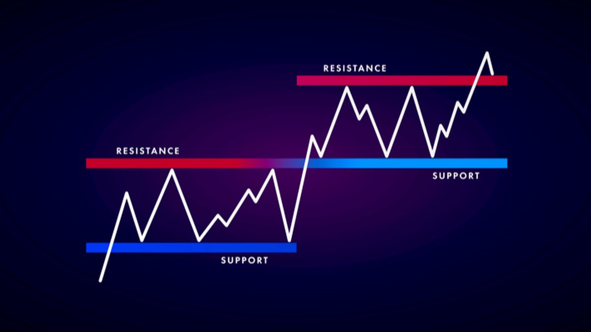
7.1 With support and resistance
One simple combination is to mark important horizontal zones on the price chart—areas where price has repeatedly stalled or reversed in the past—and then observe how MFI behaves when price revisits those levels.
- When price revisits a resistance area with MFI already elevated, some analysts become cautious about the sustainability of further gains.
- When price tests support with MFI already depressed, others look more carefully at whether selling pressure appears to be relaxing.
In both cases, the goal is not to treat MFI as a trigger, but as a way to enrich the reading of context.
7.2 With trend tools such as moving averages
MFI can also be paired with trend-following tools like moving averages:
- If the asset is trading above an upward-sloping long-term moving average, elevated MFI readings may be viewed within the broader context of an existing uptrend.
- If the asset is below a downward-sloping moving average, depressed MFI readings may simply confirm ongoing pressure rather than a looming reversal.
This helps prevent interpreting every extreme as a standalone event, encouraging users to consider where the asset sits within its larger structure.
7.3 With other oscillators
Finally, MFI is sometimes used alongside oscillators such as RSI or stochastic indicators. When multiple tools that measure different aspects of price and volume line up in a similar way, the combined context can sometimes be more persuasive than any single reading.
8. A Practical, Educational Approach to Studying MFI
For learners who want to build genuine skill with the Money Flow Index, a structured, low-pressure approach is often more effective than treating it as a shortcut.
1. Pick a liquid asset (such as a major cryptocurrency, stock index or currency pair) and apply MFI with a 14-period setting on the daily chart.
2. Scroll back in time and mark moments when MFI moved above 80 or below 20. Observe what price did next over the following days and weeks, not just the next candle.
3. Look for divergences between price and MFI around major highs and lows, noting which ones preceded meaningful shifts and which ones did not.
4. Compare with RSI on the same chart to see how the two oscillators behave differently when volume is unusually high or low.
5. Document your observations in a simple journal—what the indicator showed, what price did and what emotions you might have felt in real time.
This kind of historical review turns MFI from a mysterious line into a familiar tool whose strengths and weaknesses you understand firsthand.
9. Key Takeaways
• The Money Flow Index (MFI) is a volume-weighted oscillator that ranges from 0 to 100 and blends price with trading activity.
• MFI is constructed from Typical Price, raw money flow, sums of positive and negative flow, and a ratio transformed through an RSI-like formula.
• Readings above 80 and below 20 are often treated as markers of stretched conditions, but strong trends can keep MFI in these zones for extended periods.
• Divergences between MFI and price can highlight changes in underlying pressure, but they are not guaranteed precursors to reversals.
• MFI is best used as part of a broader framework that includes price structure, volume context, risk management and personal objectives, rather than as a stand-alone decision engine.
This guide is provided for informational and educational purposes only. It does not constitute financial, investment, tax or legal advice and should not be treated as a recommendation to buy, sell or hold any asset or to use any particular strategy. Digital assets and other financial instruments involve risk, including the potential for loss. Always consider your own circumstances and, where appropriate, consult qualified professionals before making financial decisions.