Technical Analysis Guides – Part 6: How to Read Bollinger Bands
Bollinger Bands are one of the most recognisable tools in modern technical analysis. They appear as a moving average with two envelopes wrapped around price, gently breathing in and out as volatility contracts and expands. For many chart users, they provide a quick visual answer to questions like: “Is this market quiet or active?” and “Are current prices stretched relative to recent behaviour?”
The indicator was developed by John Bollinger in the early 1980s and has since become a standard feature on charting platforms across asset classes, from equities and foreign exchange to digital assets.
This article is for informational and educational purposes only. It is not financial, investment, tax or legal advice.
1. What Bollinger Bands Actually Show
Bollinger Bands are designed to summarise two things at once:
- The trend, via a moving average in the centre; and
- The volatility, via upper and lower bands that widen or narrow as price becomes more or less active.
Instead of fixed levels, the bands adapt to the market. When price is calm and trading in a narrow range, the envelopes draw closer to the moving average. When price starts to swing more aggressively, the bands move further apart.
This makes Bollinger Bands a flexible framework for talking about “quiet vs. busy” conditions on the chart.
2. The Three Components of Bollinger Bands
A standard Bollinger Band setup consists of three lines:
- Middle band: a simple moving average (SMA), often set to 20 periods.
- Upper band: the middle band plus a multiple of the standard deviation of price.
- Lower band: the middle band minus the same multiple of standard deviation.
On many platforms, the default parameters are:
- Length: 20 periods
- Standard deviation multiplier: 2
These defaults mean that, under typical conditions, a large portion of price action will occur between the upper and lower bands. They are not magical numbers, but they have proved practical across many markets.
3. How Bollinger Bands Are Calculated (Conceptual View)
Most users never need to calculate Bollinger Bands by hand, but understanding the structure helps you interpret what you see.
- Choose a closing price series and a lookback period (for example, 20 candles).
- Compute the 20-period SMA of closing prices. This is the middle band.
- Compute the standard deviation of price over the same 20 periods. Standard deviation is a statistical measure of how far values tend to stray from their average.
- Build the upper and lower bands:
- Upper band = Middle band + (multiplier × standard deviation)
- Lower band = Middle band − (multiplier × standard deviation)
Common parameter variations include:
- Short-term view: SMA(10) with a 1.5 standard deviation multiplier.
- Medium-term view: SMA(20) with a 2.0 multiplier (the classic default).
- Long-term view: SMA(50) with a 2.5 multiplier for a slower, smoother perspective.
Shorter periods and smaller multipliers react more quickly but can be noisier; longer periods and larger multipliers are calmer but slower.
4. Band Width and Volatility
One of the most useful aspects of Bollinger Bands is band width—the distance between the upper and lower bands.
- When band width is narrow, recent price changes have been relatively small. The market is in a quiet, consolidating phase.
- When band width is wide, recent price changes have been larger. Volatility is elevated and the market is more active.
This ebb and flow often leads to the well-known idea of a “Bollinger squeeze”—a period where the bands contract significantly, suggesting that the market has been unusually calm. Many chart readers pay extra attention when such quiet phases end, as strong trends are often preceded by extended consolidations.
It is important to note, however, that a squeeze does not specify the direction of any move that may follow; it simply highlights that volatility has been compressed and may expand again.
5. How Price Interacts With the Bands
Price can behave in several characteristic ways around the bands. Understanding these behaviours can add nuance to chart reading.
5.1 Reverting toward the middle band
Because the middle band is a moving average, price frequently swings above and below it. When price touches or slightly exceeds the upper band and then starts to lose momentum, some observers see this as a move that has become stretched relative to recent volatility, with a possible tendency to drift back toward the average. The same idea applies in reverse at the lower band.
This perspective is often described as mean reversion: extended moves away from the average eventually relax back toward it. That said, mean reversion is a tendency, not a promise; strong trends can keep price near one band for longer than expected.
5.2 “Walking the band” in strong trends
In a powerful upward phase, price may repeatedly touch or approach the upper band without reversing significantly. Chart users sometimes say that price is “walking the band”. Rather than interpreting each touch as a warning of imminent decline, they view persistent contact with the upper band as a sign that buyers remain in control.
Similarly, in strong downward phases, price may hug the lower band for an extended time. In these situations, simply assuming that every band touch marks a turning point can lead to misinterpretation.
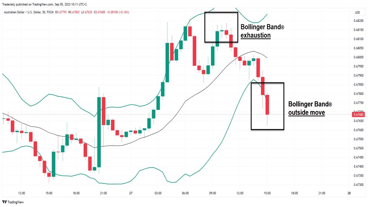
5.3 Breaks outside and returns inside
Occasionally, price pushes outside the bands before quickly returning inside. Some market observers watch these brief excursions for potential signs of exhaustion: a strong spike beyond the band followed by an immediate move back inside can suggest that an especially intense burst of volatility has just occurred.
However, context is crucial. In a quiet range, a small move outside the band may be significant; in a very volatile environment, even large moves may be part of normal conditions.
6. Common Educational Setups With Bollinger Bands
While this guide does not promote specific strategies, it is helpful to understand how Bollinger Bands are often used in educational examples.
- Squeezes and expansions: extended periods of narrow bands followed by widening, illustrating transitions from quiet to active conditions.
- Trend continuation: price 'walking the band' while the middle band slopes in the direction of the move.
- Potential exhaustion: sharp moves outside a band that quickly revert, especially when accompanied by other signs of fading momentum.
In all cases, the key idea is to read Bollinger Bands as context—where price sits relative to recent volatility—rather than as hard rules.
7. Bollinger Bands vs. Keltner Channels
Another popular volatility framework is the Keltner Channel. Although both indicators draw dynamic envelopes around price, their construction is different:
- Bollinger Bands typically use a simple moving average (SMA) and standard deviation to set band width.
- Keltner Channels often use an exponential moving average (EMA) and the Average True Range (ATR) to define the distance from the centre line.
A common Keltner configuration might be:
- Middle line: EMA(20)
- Upper line: EMA(20) + 2 × ATR(10)
- Lower line: EMA(20) − 2 × ATR(10)
Because ATR measures average range rather than statistical dispersion, Keltner Channels can feel smoother and, in some markets, may hug price more tightly than Bollinger Bands. Some analysts even overlay both indicators:
- When Bollinger Bands move inside the Keltner Channels, it can highlight particularly quiet phases.
- When Bollinger Bands expand beyond the Keltner envelope, it can highlight a surge in volatility.
Neither tool is inherently superior; they emphasise different aspects of volatility. Using them together can provide a richer perspective.
8. Using Bollinger Bands on a Charting Platform
Most modern platforms make it easy to explore Bollinger Bands hands-on. A typical process might look like this:
- Open the asset you want to study (for example, a 4-hour or daily chart of a major cryptocurrency pair).
- Locate the Indicators menu and search for “Bollinger Bands”.
- Add the indicator to your chart. The default settings are usually a 20-period SMA with a 2-standard-deviation envelope.
- Observe how the bands respond during quiet consolidations compared with more volatile phases, and note how price behaves at the edges of the envelope.
- Experiment—carefully—with different lookback periods and multipliers to see how sensitivity and smoothness change.
When experimenting, it helps to keep a journal of what you see: where squeezes occurred, how trends interacted with the bands and how other tools (such as volume or momentum indicators) behaved at the same time.
9. Common Pitfalls and Good Practices
Because Bollinger Bands are visually intuitive, it is easy to over-rely on them. A few reminders can help keep usage balanced:
• Not every touch is a turning point. Price can and does stay near a band for extended periods during strong trends.
• Volatility is not direction. Wide bands indicate that price is moving more aggressively, but they do not say which way it must move next.
• Parameters matter. Very short lengths or small multipliers can make the bands overly reactive; very long lengths can make them sluggish. It is worth testing settings on historical data before relying on them.
• Combine with other information. Many users pair Bollinger Bands with basic market structure, support and resistance, or momentum tools such as RSI or MACD to create a fuller context.
Above all, it is useful to remember that Bollinger Bands describe how price has behaved recently; they do not guarantee what comes next.
10. Key Takeaways
• Bollinger Bands consist of a middle moving average and two volatility-based envelopes above and below it.
• The bands widen when volatility rises and contract when volatility falls, providing a visual map of quiet versus active conditions.
• Touches, squeezes and periods where price “walks the band” can all offer useful context, especially when combined with broader trend analysis.
• Bollinger Bands and Keltner Channels are related but distinct; using both can highlight transitions in volatility more clearly.
• As with any indicator, Bollinger Bands are most effective when integrated into a thoughtful, risk-aware framework that respects personal objectives and does not rely on any single tool.
This guide is provided for informational and educational purposes only. It does not constitute financial, investment, tax or legal advice and should not be treated as a recommendation to buy, sell or hold any asset or to use any particular strategy. Markets can be volatile and involve risk, including the possibility of loss. Always consider your own circumstances and, where appropriate, consult qualified professionals before making financial decisions.