Technical Analysis Guides – Part 2: How the Parabolic SAR Indicator Works
The Parabolic SAR is a classic trend-following indicator created by J. Welles Wilder and published in his 1978 book on technical trading systems. In the same work, he introduced several other widely used tools, including the Relative Strength Index (RSI), Average True Range (ATR) and the Directional Movement Index (ADX). Despite the age of these ideas, they continue to appear in modern charting platforms across equity, foreign exchange and digital asset markets.
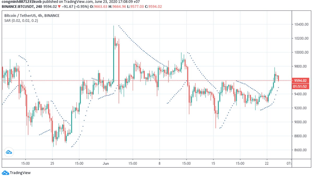
SAR stands for “Stop And Reverse”. The indicator plots a series of dots above or below price, forming a parabolic curve that attempts to track the direction of a move. When the trend shifts in the indicator’s logic, the dots flip to the opposite side of the candles, symbolising a potential change in direction.
As with all tools in this series, this guide is for informational and educational purposes only. It does not provide financial, investment, tax or legal advice.
1. What Is the Parabolic SAR?
The Parabolic SAR is a price-and-time-based indicator designed to highlight the current trend and potential points where that trend may be losing strength. Instead of appearing in a separate panel like RSI or MACD, it is drawn directly on the price chart as small dots (or markers).
In its standard form:
- When the dots are below price, the indicator is reflecting an upward phase in its internal logic.
- When the dots are above price, the indicator is reflecting a downward phase.
As price moves and time passes, the dots follow along in a curved, parabolic pattern. When a move continues, the dots gradually “catch up” to price; when price crosses the dot line, the indicator flips to the other side, marking a potential trend change in the Parabolic SAR framework.
2. How the Parabolic SAR Is Calculated (Conceptual Overview)
Wilder’s original formula for the Parabolic SAR is precise but can look intimidating at first glance. Modern charting software calculates it automatically, so most users focus on the values, not the raw arithmetic. Still, understanding the structure of the formula helps explain why the dots behave the way they do.
In simplified form, the Parabolic SAR for the current period can be written as:
SAR(t) = SAR(t−1) + AF × (EP(t−1) − SAR(t−1))Where:
- SAR(t) is the indicator value for the current period.
- SAR(t−1) is the value from the previous period.
- EP(t−1) is the “extreme point” from the current trend so far:
- In an upward phase, this is typically the highest high reached since the trend began.
- In a downward phase, it is the lowest low reached since that phase began.
- AF is the acceleration factor, a parameter that increases as the trend extends, causing the dots to move closer to price over time.
In Wilder’s original design, the acceleration factor starts at a baseline (often 0.02) and increases in discrete steps (for example, in increments of 0.02) whenever a new extreme point is reached, up to a maximum cap (often 0.20). This mechanism causes the dots to move faster as a trend goes on, which is why the curve looks parabolic.
In practice:
- Lower AF values make the indicator smoother and slower, potentially missing minor turns but reducing noise.
- Higher AF values make it more responsive, at the cost of more frequent flips in choppy markets.
3. How the Dots Move With Price
The behaviour of the Parabolic SAR can be understood in two main phases: the trend-following phase and the flip phase.
3.1 Trend-following phase
Suppose an upward move is underway:
- The Parabolic SAR begins with dots below price.
- As each new candle forms, the SAR value for the next period is recalculated using the prior SAR, the acceleration factor and the extreme point.
- If price makes a new high, the extreme point (EP) is updated, and the acceleration factor may increase up to its maximum. This causes the dots to move closer to price.
- As long as price remains above the curve, the indicator considers the upward phase intact.
The same logic applies in reverse for a downward phase, with dots above price tracking the move lower.
3.2 Flip phase: potential trend changes
Eventually, price may move in the opposite direction strongly enough that it crosses the projected SAR value for the next period. When this happens:
- The indicator flips the dots to the other side of price.
- A new trend phase is considered to have started in the Parabolic SAR framework.
- The extreme point is reset based on the first high or low of the new phase, and the acceleration factor is set back to its initial value.
This flipping behaviour is why the indicator is sometimes described as a “stop and reverse” system: it alternates between upward and downward phases based on price crossing the parabolic curve.
4. Interpreting Parabolic SAR in Trending vs. Ranging Markets
The Parabolic SAR is often most informative when a market is in a clean, directional trend. In those conditions, the dots tend to follow price smoothly, and flips between sides may align with meaningful shifts in behaviour.
In contrast, when price is trading inside a sideways range with frequent back-and-forth moves, the indicator can flip repeatedly. That can create many small, alternating moves in the dots without a clear directional message. In technical jargon, this is sometimes called being “whipsawed”.
Because of this, many chart readers treat the Parabolic SAR as a tool that:
- Helps highlight and follow sustained trends, and
- Is less reliable on its own in low-volatility, sideways conditions.
5. How Market Participants Use Parabolic SAR in Practice
Different traders and investors integrate the Parabolic SAR into their workflows in different ways. Below are some common educational use cases, described in neutral terms.
5.1 Observing trend direction
At the most basic level, the placement of the dots is used to summarise the current directional bias in the indicator’s logic:
- Dots below price: the Parabolic SAR is in an upward phase, suggesting that the recent path has been dominated by higher highs and higher lows.
- Dots above price: the indicator is in a downward phase, reflecting that price has been moving lower overall.
Some market observers keep the chart very simple: they look at whether most of the recent candles have dots above or below them to quickly gauge whether the indicator is treating the environment as trending up or trending down.
5.2 Studying potential exit areas
Because the dots gradually move closer to price as a trend extends, the Parabolic SAR is often used in examples that focus on exit management rather than initial entries. A typical educational perspective looks like this:
- During an upward phase, as long as price remains above the dots, the trend is considered intact in the indicator’s framework.
- If price closes below the dots and the indicator flips, some analysts treat that as a cue to reassess the move or to scale back exposure.
- Similarly, in a downward phase, a close above the dots followed by a flip may be interpreted as a sign that downward momentum is weakening.
In this view, the Parabolic SAR acts like a trailing reference line that moves with price and eventually “catches up”, potentially marking the point where the prior move has run its course in the indicator’s logic.
5.3 Timeframe considerations
The choice of timeframe has a major impact on how often the dots switch sides:
- On higher timeframes (such as daily or weekly charts), flips may occur less frequently and align more closely with major swings in trend.
- On lower timeframes (such as 5-minute or 15-minute charts), even modest back-and-forth moves can cause frequent flips.
Many beginners find it easier to start with higher timeframes when learning how the Parabolic SAR behaves, and only later explore shorter horizons.
6. Combining Parabolic SAR With Other Indicators
The Parabolic SAR is rarely used as the only tool on a chart. More often, it is combined with at least one additional indicator or with simple price structure analysis to create a fuller picture.
6.1 Moving averages for trend context
A common pairing is to combine the Parabolic SAR with a long-term moving average such as the 100- or 200-period simple moving average (SMA):
- If price is trading above a rising long-term moving average, some analysts consider the environment broadly constructive. In that context, Parabolic SAR dots flipping below price may be read as aligning with the higher-timeframe upward bias.
- If price is below a declining long-term moving average, the broader backdrop is often seen as cautious, and Parabolic SAR dots above price may be given more weight when they align with that downward context.
This kind of combination can help users avoid treating every flip as equally important; it encourages them to ask whether the indicator is flipping in the same direction as the larger trend or against it.
6.2 Oscillators for momentum context
Some chart users also look at oscillators such as RSI or stochastic indicators alongside Parabolic SAR:
- If an upward phase in the Parabolic SAR coincides with an oscillator that is recovering from weak levels, the move may be interpreted as a fresh push after a cooldown.
- If a potential reversal in the Parabolic SAR appears when an oscillator is already stretched, it may be viewed as additional confirmation that momentum is changing.
Again, these are not guarantees—only contextual clues that can support a structured reading of the chart.
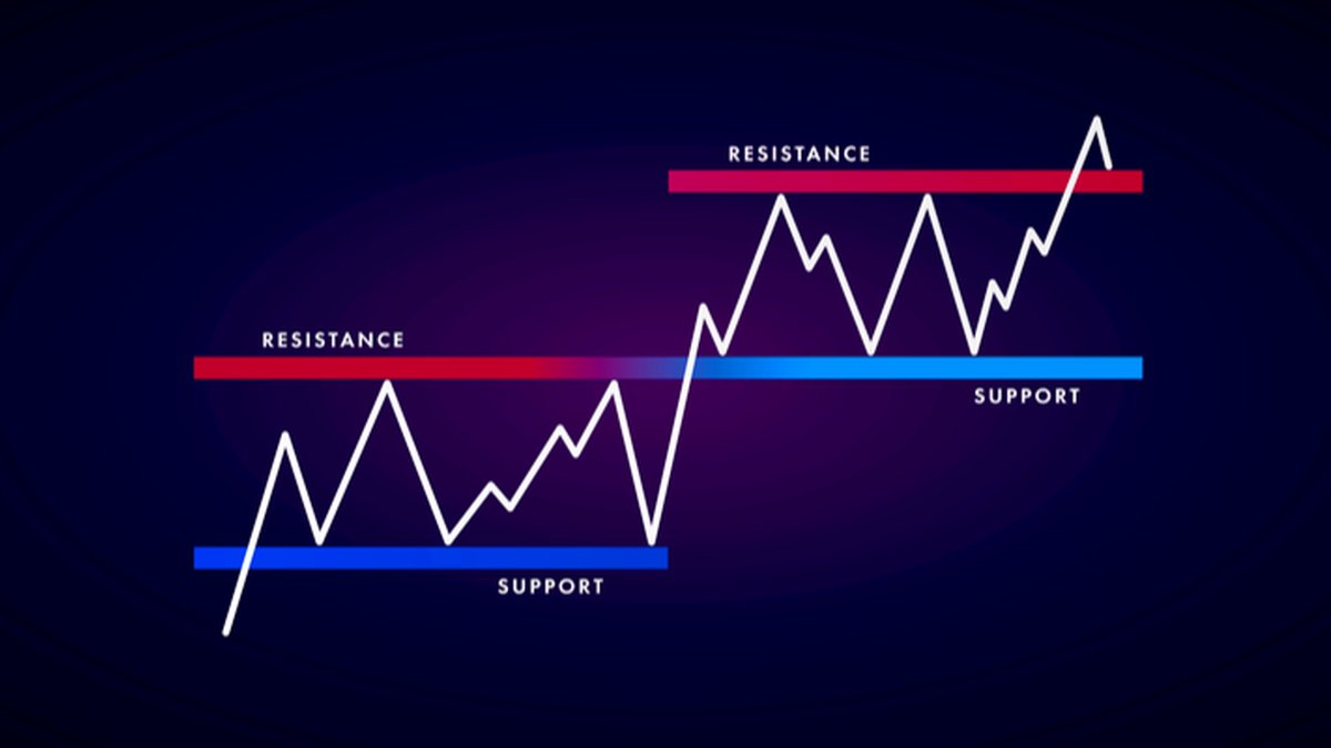
6.3 Price structure and support/resistance
Beyond indicators, many technicians mark support and resistance zones directly on the chart and then observe how Parabolic SAR behaves around those levels. For example:
- A flip from dots below price to dots above price near a well-defined resistance region may add weight to the idea that the up-move is pausing.
- Conversely, a flip from dots above to dots below near a strong support area may be seen as a sign that buyers are becoming more active.
This combination of structural levels and indicator behaviour can be more informative than any single tool on its own.
7. Limitations and Psychological Pitfalls
Despite its simplicity, the Parabolic SAR has clear limitations and can influence behaviour in ways that users should understand.
7.1 Whipsaws in sideways markets
In markets that lack a clear trend, price often oscillates around a central area without making sustained progress. In these conditions, the Parabolic SAR may flip repeatedly as price crosses above and below the dots. If a user responds mechanically to each flip, that can translate into a series of unhelpful, back-and-forth decisions.
7.2 Sensitivity to parameter choices
The acceleration factor and its maximum value directly affect how quickly the dots move toward price. Parameters that are too aggressive can cause the indicator to switch sides so often that it becomes difficult to interpret. Parameters that are too conservative can lag far behind price and respond slowly to genuine changes in trend.
In practice, many chart users start with the default values provided by their platform and then experiment thoughtfully, reviewing how different settings would have behaved on historical data before considering them in live environments.
7.3 Overconfidence and overactivity
Because the Parabolic SAR plots many distinct dots on every chart, it can be visually tempting to treat each change as a call to action. This can encourage overactivity, where users feel pressure to respond to every small shift rather than focusing on a clear, well-defined plan.
One way to counter this tendency is to use the indicator in conjunction with higher-timeframe analysis and written rules—for example, only paying attention to flips that occur near major support or resistance zones or that align with a broader trend assessment.
8. A Structured, Educational Approach to Learning Parabolic SAR
For readers who want to understand the Parabolic SAR more deeply, it can be helpful to treat it as part of a learning process rather than as a shortcut to decisions. A simple framework might look like this:
1. Start with a clean chart of a liquid asset (such as a major currency pair, stock index or large-cap digital asset) on a daily timeframe.
2. Add the default Parabolic SAR settings and scroll back in time. Observe how the dots behaved during clear trends and during sideways periods.
3. Mark a few major swings on the chart by hand and see where the dot flips occurred relative to those swings.
4. Experiment with different AF parameters in a sandbox environment, noting how higher or lower values change the frequency of flips.
5. Combine with a moving average or a simple oscillator to see how multiple tools can reinforce or contradict each other.
This kind of historical study helps build intuition about the indicator’s strengths and weaknesses before it is used in any real decision-making context.
9. Key Takeaways
• The Parabolic SAR is a trend-following indicator that plots a series of dots above or below price and flips sides when its internal logic detects a change in direction.
• It was introduced by J. Welles Wilder in 1978, alongside other foundational tools like RSI, ATR and ADX.
• The indicator is driven by a formula that incorporates an acceleration factor and an extreme point, causing the dots to move closer to price as a trend extends.
• Parabolic SAR tends to be most helpful in clear trending environments and can generate frequent, less useful flips in sideways markets.
• Many users focus on the indicator as a way to summarise trend direction and study potential exit areas, often combining it with moving averages, oscillators and support/resistance analysis.
• Like all technical tools, it has limitations and should be integrated into a broader framework that includes risk awareness, fundamental context and personal objectives.
This article is provided for informational and educational purposes only. It does not constitute financial, investment, tax or legal advice, and it should not be treated as a recommendation to buy, sell or hold any asset or to engage in any specific strategy. Digital assets and other financial instruments involve risk, including the possibility of loss. Always consider your own circumstances and, where appropriate, consult qualified professionals before making financial decisions.