When Every Cohort Buys: What Synchronized Bitcoin Accumulation Really Signals
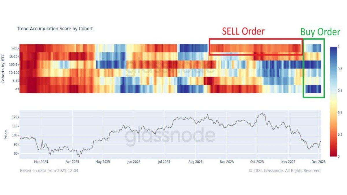
The latest Trend Accumulation Score heatmap from Glassnode captures a moment that does not come around very often. For the first time in months, the major Bitcoin holder cohorts—from tiny wallets with less than one BTC all the way up to addresses controlling more than 10,000 BTC—are leaning in the same direction. Across the board, the colours on the right side of the chart tilt towards blue, indicating net accumulation.
In ordinary conditions, different groups tend to move out of phase. Long-term holders might quietly buy while short-term traders take profits; large entities may distribute coins into retail enthusiasm; or, during stress events, smaller investors capitulate while patient capital steps in. Seeing almost every stripe on the chart swing toward accumulation at once is unusual, and it tells us something important about how the market has digested the recent drawdown.
This article unpacks what the Trend Accumulation Score actually measures, walks through how each cohort has behaved in 2025, and explores what this rare alignment might mean for the next stage of the cycle. The goal is not to shout “bottom is in” but to explain how this kind of on-chain pattern fits into a broader, brand-safe view of Bitcoin’s evolving market structure.
1. Reading the Trend Accumulation Score Heatmap
The top panel of the chart is a grid. On the vertical axis sit five main cohorts, grouped by the size of their Bitcoin holdings:
- >10,000 BTC – mega-whales, typically exchanges, funds or very large treasuries.
- 1,000–10,000 BTC – classic whales: desks, early adopters, corporate treasury-style entities.
- 100–1,000 BTC – often called “sharks”, including professional traders, funds and high-net-worth individuals.
- 10–100 BTC and 1–10 BTC – established retail and smaller professional participants.
- <1 BTC – the broad base of small holders, from first-time buyers to serious accumulators who prefer many small UTXOs.
Each vertical slice of the heatmap represents a day. The colour of every cell shows whether that cohort, on that day, was:
- Accumulating – buying more BTC than they spent (blue shades).
- Distributing – reducing their net holdings (red shades).
- Neutral – little change either way (light colours around the centre of the scale).
The lower panel overlays this behaviour on top of the price trend. By matching changes in colour with moves in the BTC price, we can infer which groups are leaning into strength, which are fading rallies, and which are stepping in during weakness.
2. From Distribution to Alignment: What Changed in Late 2025?
The red box on the chart, spanning roughly September through late November, shows a clear pattern: large holders were distributing. The >10k BTC row is dominated by warm shades, indicating that mega-whales were net sellers for an extended period. The 1k–10k cohort, while slightly more mixed, also shows repeated streaks of orange and red. During the same window, Bitcoin’s price drifted lower from the earlier six-figure region towards the high-80k and low-90k zone.
In other words, the “sell order” phase was driven mainly from the top of the ownership ladder. Large entities were trimming exposure, realising gains or reallocating capital while smaller cohorts oscillated between mild accumulation and mild distribution.
The right edge of the chart tells a different story. As the calendar turned toward December, the colour palette shifted dramatically:
• The >10k BTC cohort flipped from sustained selling to net accumulation. After months of reducing their holdings, mega-whales are now adding coins on net.
• The 100–1,000 BTC “sharks” show some of the deepest blues on the board, signalling that mid-sized professional and high-net-worth participants are currently the most aggressive buyers.
• The <1 BTC cohort has also turned blue, indicating that smaller holders—often retail participants—are returning to steady spot purchases.
• The 1,000–10,000 BTC band has moved from clear distribution to a more neutral stance, with a few hints of accumulation rather than strong selling.
Put together, this is what analysts refer to as synchronized accumulation: most segments of the market are either buying or, at minimum, no longer pushing new supply into the market at the same time.
3. Zooming In on Each Cohort
3.1 Mega-Whales (>10,000 BTC): From Offloading to Quiet Rebuilding
For much of the autumn, the largest addresses behaved like a slow-moving selling program. Their distribution lined up with moments of elevated prices and high derivatives activity, suggesting that some institutional or treasury-style holders were realigning risk after a strong run-up earlier in the year.
The recent turn toward accumulation suggests that this phase of balance-sheet management may be largely complete. Instead of consistently feeding coins into the market, these entities are now absorbing a portion of the available supply. Because each address in this cohort controls enormous balances, even modest shifts in behaviour can materially affect the supply–demand balance.
3.2 Classic Whales (1,000–10,000 BTC): From Active Sellers to Neutral
The next rung down—the 1k–10k BTC cohort—has not yet flipped as decisively into buying mode, but the steady streaks of red have faded. This group appears to have largely paused its earlier distribution. Neutral shades indicate that these addresses are letting the market settle, perhaps waiting for clearer macro signals before taking on more directional exposure.
This neutrality is still a meaningful change. When a key selling cohort stops providing supply into every rally, it becomes easier for new demand to have an impact on price, particularly if other groups are actively accumulating.
3.3 “Sharks” (100–1,000 BTC): The Most Determined Accumulators
Mid-sized holders between 100 and 1,000 BTC stand out as the most persistent buyers on the chart. Deep blue patches show that this cohort has been adding steadily not only after the recent drawdown, but even during earlier phases when prices were near local highs.
This behaviour is characteristic of entities with a structured accumulation plan: smaller funds, family offices, proprietary desks and well-capitalised individuals. They have the capacity to buy in size, but not the massive footprint of mega-whales. Their continued accumulation through volatility suggests a multi-year thesis rather than a short-term trade.
3.4 Established Retail (1–10 BTC and 10–100 BTC): From Side-Lines to Spot Re-Entry
The mid-retail bands, especially 1–10 BTC, spent much of 2025 oscillating between light accumulation and light distribution. During the more intense parts of the correction, many of these holders reduced exposure or simply stopped adding, reflecting caution after a turbulent year.
In early December, the colours begin to cool again. These cohorts are quietly returning to accumulation, but in a more measured way than the sharks. That lines up with anecdotal reports of investors who had previously focused on complex derivatives returning to simpler, fully funded spot positions. After a year when geared exposure caused stress for many households, reallocating savings into unleveraged holdings is a sign of a healthier risk posture.
3.5 Small Holders (<1 BTC): Rebuilding After a Derivatives Hangover
Perhaps the most psychologically interesting shift is in the smallest cohort: wallets holding less than one BTC. Earlier in the year, this group showed fragmented behaviour. Some addresses continued to accumulate, but others reduced holdings or diverted capital into derivatives platforms in search of faster returns.
The heatmap now shows a strong return to blue in this row. That suggests that many small participants are re-funding their spot positions after experiencing the volatility of geared products. Instead of chasing fast outcomes, they appear to be focusing on gradually building exposure over time. From a market-health perspective, this is encouraging: heavy use of leverage by small, inexperienced participants tends to amplify both euphoria and stress, whereas slow spot accumulation is easier to sustain.
4. Why Synchronized Accumulation Is Rare
Markets are ecosystems. In most phases, different groups play different roles: some supply liquidity, some absorb it; some rebalance portfolios, others express long-term conviction. That natural diversity of behaviour is healthy but means that genuine alignment—where nearly everyone is, at minimum, not selling—is unusual.
Synchronized accumulation often occurs after three conditions have been met:
1. Excess leverage has been flushed out. The sharp liquidations in October and the quieter follow-through in November did exactly that. With fewer highly geared positions, selling pressure from forced unwinds has diminished.
2. Valuations have retraced from extremes. Once prices move far enough below recent highs, they become more attractive for both long-term allocators and disciplined mid-sized players. Opportunistic buying starts to outweigh profit-taking.
3. A macro narrative begins to stabilise. Hints that the Federal Reserve is nearing the end of its tightening cycle, combined with signs of easing balance-sheet headwinds, have reduced uncertainty even if the path of interest rates is not yet fully settled.
When all three align, it becomes rational for many cohorts to shift from defense to cautious accumulation. That is what the current heatmap suggests: the market is no longer dominated by one group urgently trying to exit. Instead, various cohorts are independently concluding that current levels represent an acceptable long-term entry zone.
5. What This Means for Liquidity and Volatility
From a market-structure perspective, synchronized accumulation generally has three consequences.
First, it supports the emergence of a price floor. When most cohorts are either buying or neutral, downside moves run into more passive bids. This does not eliminate volatility—macro headlines and large single-entity decisions can still move price—but it dampens the risk of uncontrolled cascades.
Second, it gradually rebuilds liquidity depth on the bid side. As more coins move into long-horizon hands, short-term float on exchanges may decline, but the willingness of these holders to support the market on dips can increase. Over time, this can create the conditions for a more orderly advance if new demand appears.
Third, it changes the risk balance for future shocks. When different cohorts accumulate at different times, stress can concentrate in one segment. In contrast, when they accumulate together, any adverse event is spread across a more diversified base of holders. That does not eliminate risk, but it can make the overall system more resilient.
6. Looking Ahead to Q1 2026: A Constructive but Conditional Outlook
It is tempting to jump from “everyone is buying” to “a major rally is imminent”. Responsible analysis needs one more step: acknowledging the conditions under which this optimistic scenario might play out.
If synchronized accumulation persists, several longer-term dynamics could support a constructive first quarter in 2026:
• Macroeconomic tailwinds. Further confirmation that policy rates are peaking or gently declining would lower the opportunity cost of holding non-yielding assets and could encourage additional institutional allocations.
• Continued growth of regulated vehicles. Spot exchange-traded funds and structured products offer large pools of capital a compliant way to allocate to BTC. If inflows remain steady while on-chain cohorts hold or add coins, available supply for new entrants shrinks.
• Improved sentiment after a difficult year. Many participants spent much of 2025 navigating sharp swings and derivative-driven stress. A phase of calmer price action supported by steady accumulation can rebuild confidence and reduce headline-driven reactions.
However, it is equally important to outline what could disrupt this picture:
- Unexpected macro shocks such as severe economic data surprises or policy reversals could pull liquidity back out of risk assets.
- Regulatory developments, both positive and negative, may change the pace at which institutions are comfortable deploying capital.
- Large, idiosyncratic decisions by major holders—corporate treasuries, funds or governments—could temporarily overpower the gradual accumulation seen in the heatmap.
In other words, synchronized accumulation improves the foundation for a potential recovery, particularly into Q1 2026, but it does not remove uncertainty. Markets can remain volatile even when on-chain indicators look constructive.
7. How to Use This Data in a Brand-Safe, Educational Way
The Trend Accumulation Score is powerful because it reveals behaviour that price alone cannot show. But like all on-chain tools, it works best as context, not as a step-by-step instruction manual. A few guidelines can help keep its use responsible:
1. Focus on regimes, not single days. The significance of the current pattern lies in the broad blue streaks across multiple cohorts, not in any one day’s reading.
2. Combine with other indicators. Funding rates, exchange balances, ETF flows and macro data can confirm or challenge what the heatmap appears to suggest.
3. Match data to time horizon. Synchronized accumulation speaks to medium- and long-term positioning. It is less relevant for intraday decisions, where microstructure and short-term news dominate.
4. Avoid over-confidence. Even well-constructed on-chain metrics cannot predict the future with certainty. They describe current behaviour under current conditions.
Used this way, the Trend Accumulation Score becomes a teaching tool: it reminds us that behind the ticker are millions of different decisions by families, funds, companies and institutions, each responding to incentives and constraints that change over time.
8. Conclusion: A Market Trying to Heal
The newest Trend Accumulation Score heatmap offers a rare snapshot of alignment in the Bitcoin ecosystem. After months in which large holders were steadily reducing exposure, mega-whales have turned back to net accumulation. Mid-sized “sharks” are buying most aggressively, smaller retail cohorts are rebuilding spot positions, and the classic whale band has shifted from consistent selling to a more neutral stance.
This synchronized accumulation does not guarantee that the recent lows will mark a permanent bottom, but it strongly suggests that the market has moved beyond the most acute phase of distribution. Instead of pushing against a continuous tide of supply, new demand entering the system in the months ahead is more likely to be reflected in price.
For observers, the key takeaway is straightforward: behind the volatility and headlines, Bitcoin’s ownership base is quietly re-aligning itself. If this pattern persists and is supported by a friendlier macro backdrop, Q1 2026 could mark the beginning of a more constructive chapter for both BTC and the broader digital asset market. As always, patience, diversification and a clear understanding of personal risk tolerance remain more important than any single indicator—no matter how striking the colours on the heatmap may appear.
Disclaimer: This article is for informational and educational purposes only. It does not constitute financial, investment, legal or tax advice, and it should not be treated as a recommendation to buy, sell or hold any digital asset. Digital asset markets are volatile and can involve significant risk, including the possibility of total loss. Readers should conduct their own research and, where appropriate, consult qualified professionals before making decisions related to cryptocurrencies or other financial instruments.