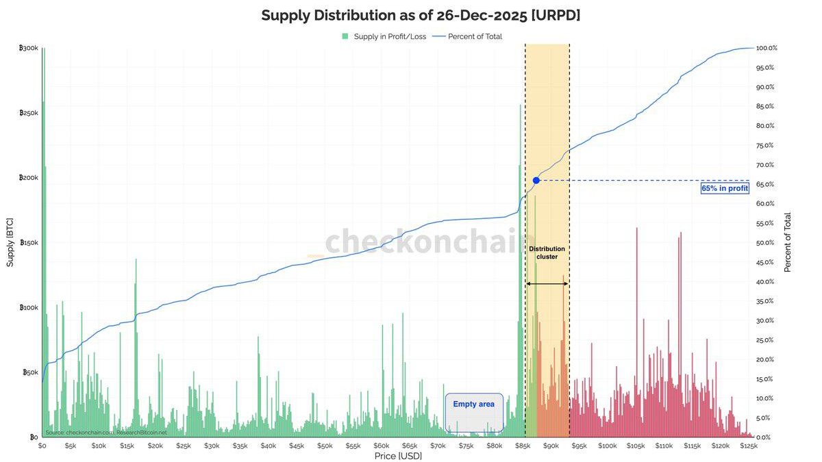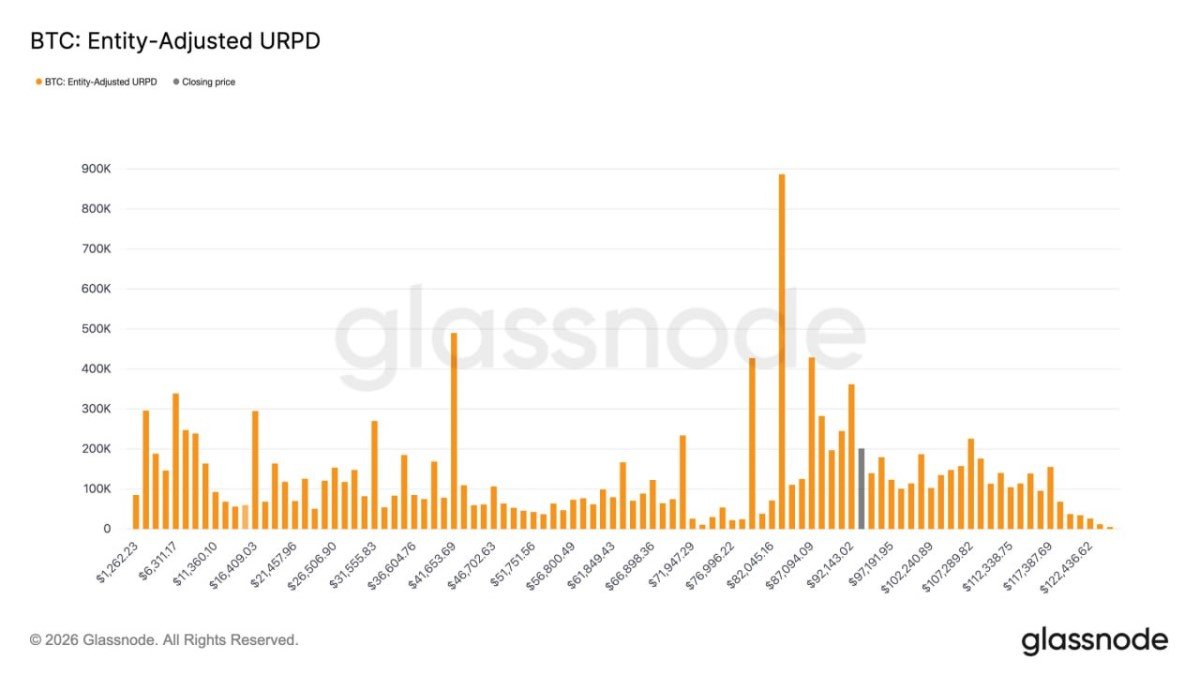
Bitcoin Enters a “Thick” Cost-Basis Zone: How Entity-Adjusted URPD Explains the Next Fight (92K–117K)
When traders talk about resistance, they usually point at a line on a chart. But Bitcoin often respects something less visible: where large groups of coins were actually bought. That’s what URPD tries to capture—an on-chain memory of price levels where the market committed real capital, not just drew a rectangle.
The interesting twist right now is this: profit-taking pressure may have eased compared with late 2025, yet Bitcoin is moving into a dense cost-basis region around $92K–$117K. This is the kind of zone that can feel “sticky” and emotional—because it’s where many holders go from underwater to whole again. Markets don’t trade morality or narratives; they trade human behavior at scale.
What Entity-Adjusted URPD Really Measures (And Why It’s Different From “Whale Charts”)
URPD stands for UTXO Realized Price Distribution. In plain terms, it’s a histogram of Bitcoin supply grouped by the price at which coins last moved on-chain. If a large amount of BTC last changed hands around a certain level, URPD will show a tall bar there—an on-chain footprint of where buyers and sellers shook hands.
The “entity-adjusted” part matters because raw on-chain data can be noisy: exchanges reshuffle wallets, custodians consolidate UTXOs, and internal transfers can distort the signal. Entity-adjusted methods aim to cluster addresses that likely belong to the same entity, reducing false spikes. It’s still an estimate, but it’s often closer to the economic truth: where real ownership effectively sits.
How to read it, quickly:
• Tall bars = lots of BTC last moved at that price (a cost-basis crowd).
• Revisiting a tall bar = many holders approach breakeven or profit at the same time.
• Result = potential “overhead supply” (selling) or “defensive support” (buying/holding), depending on holder psychology.
Why $92K–$117K Can Behave Like an Invisible Ceiling
Dense URPD zones are not magical. They’re simply crowded. And crowded zones amplify reflexes. If price enters a region where many participants bought, the market reactivates old decisions: “I should have sold,” “I should have bought more,” “I just want my money back.” This is why cost-basis bands often behave like memory foam: price sinks in, struggles, and only later either escapes cleanly or slides back.
In your framing, the thick region sits roughly between $92K and $117K. That suggests a meaningful amount of supply last moved there. If Bitcoin trades into the lower edge of that band, a portion of holders who endured the move down toward the ~$80K area may finally see daylight—creating a very specific kind of sell pressure: the breakeven exit.
Why breakeven selling is uniquely powerful:
• It’s not greed, it’s relief. Relief selling can appear even when the long-term thesis remains intact.
• It’s clustered. Many participants reach “whole again” around the same time.
• It’s news-sensitive. Any negative headline can tip “I’ll wait” into “I’m out.”
The Paradox: “They Didn’t Sell at $80K” Can Be Bullish and Bearish
There’s an important nuance here that most news-style writeups miss. If this group bought the trend earlier and didn’t sell during the drop, that signals they are not purely weak hands. That’s constructive. It implies a portion of the supply in this band is held by people with either conviction, longer horizons, or constraints that discourage panic-selling.
But the same fact can produce the opposite behavior when price returns. Some holders don’t capitulate in the red—but they do de-risk when the screen turns green again. They waited for the chance to exit without admitting a loss. That’s not irrational; it’s how many real-world portfolios behave under drawdown rules, committee pressure, or personal risk limits.
So the zone can create two competing forces at once:
• Sticky supply: holders who proved conviction may continue to hold, reducing selling.
• Reactive supply: holders who endured pain may sell at breakeven, increasing churn.
• The winner is decided by liquidity—how much fresh demand arrives while price is inside the band.
Why “Profit-Taking Is Down” Doesn’t Contradict “This Zone Is Heavy”
It’s easy to get confused when one metric says selling pressure cooled while another warns of overhead supply. They’re talking about different layers of reality. Realized profit metrics are about flow—what is being sold at a profit right now. URPD is about stock—where the existing supply is positioned based on cost basis.
Flow can calm down while stock remains loaded. That simply means the market has stopped actively distributing for the moment, but it is now approaching a place where distribution could restart. In practical terms: the road is less windy, but you’re approaching a crowded intersection. The breakout attempt matters less than the market’s behavior after the attempt—does it keep absorbing, or does it start rejecting repeatedly?
How This Typically Plays Out: Three “Market Structure” Paths (Not Predictions)
Because this is a thick cost-basis band, it often produces messy price action before clarity. That’s not a flaw of Bitcoin—it’s a feature of crowd behavior. If you treat the next move as a single binary bet, you’ll miss the more realistic truth: markets probe, retreat, and probe again until one side runs out of ammunition.
Path A — Acceptance and expansion: price pushes through the band’s upper region (near ~$117K), and pullbacks start holding higher levels. In URPD terms, the market “reprices” supply above the zone, converting former sellers into holders.
Path B — Choppy range: price oscillates within ~$92K–$117K as breakeven exits meet new inflows. This is where traders get bored and over-leverage—ironically creating the volatility they complain about later.
Path C — Rejection and retest: price fails to clear the zone and slips below the lower edge. If the market is healthy, it can retest demand below $92K and rebuild. If liquidity is weak, the move can accelerate because “relief sellers” become “fear sellers.”
What to Watch While Price Is Inside the Band
URPD gives you the map, but not the live traffic. To understand whether the market is absorbing supply or being overwhelmed by it, you watch for confirmation through behavior—not slogans. The key is to identify whether selling is becoming systematic (persistent) or merely episodic (short bursts that get bought).
Educational checklist (no trading instructions):
• Rejection frequency: repeated failures near the same levels suggest overhead supply is active.
• Breakout quality: clean follow-through with shallow pullbacks suggests absorption.
• Sensitivity to headlines: if minor news triggers outsized dumps, breakeven psychology is dominant.
• On-chain follow-up: a renewed rise in realized profits while price is in the band can indicate distribution is turning back on.
Conclusion: The Next Move Is Less About “Bullish News” and More About Absorption
The main takeaway from the entity-adjusted URPD view is not that Bitcoin is “about to pump” or “about to dump.” It’s that Bitcoin is entering a region where a lot of capital previously took a position—and that makes price more reactive. The $92K–$117K band can behave like an invisible ceiling because breakeven is a powerful human magnet.
The optimistic interpretation is straightforward: if this cohort barely sold the dip toward ~$80K, supply may be stickier than many assume. If demand is steady, absorption can turn this thick zone from a ceiling into a launchpad. The cautious interpretation is equally valid: thick zones often require time, and impatience tends to manufacture volatility through leverage. Either way, this is market structure—not mythology—and it’s one of the cleanest places where on-chain data explains what price charts only hint at.
Frequently Asked Questions
What does URPD tell me that a normal chart doesn’t?
A normal chart shows where price traded. URPD suggests where today’s holders actually acquired coins (cost basis clusters). That can reveal why certain levels behave like sticky support/resistance even when technical lines look arbitrary.
Why is a “thick” band sometimes harder to break than a single resistance line?
Because it represents many decision-makers reaching breakeven or profit together. That creates clustered behavior—especially relief selling—and can force the market to spend time absorbing supply.
If profit-taking pressure cooled recently, why worry about this zone at all?
Because realized profit is flow (current selling), while URPD is stock (where supply sits). Selling can be quiet until price revisits a dense cost-basis region—then behavior can change quickly.
Does entering $92K–$117K mean Bitcoin must drop?
No. It means the market is entering a crowded zone where both outcomes are plausible. A clean breakout requires sufficient demand to absorb overhead supply. A rejection is more likely if liquidity is thin and holders become news-sensitive.
Disclaimer: This article is for informational and educational purposes only and does not constitute investment, legal, or tax advice. Nothing herein is a recommendation to buy, sell, or hold any asset. Digital assets are volatile and carry risk, including the risk of total loss.